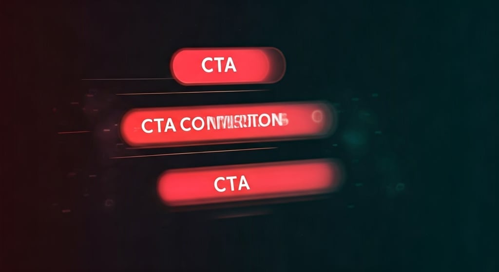
How to Build and Optimize CTA Buttons That Convert
Effective Call-To-Action (CTA) buttons play a big role in shaping the user experience. They help guide people and can boost how many visitors take the next step. CTA buttons work as main points for users to click on. They bring together valuable content and good web design in one clear place. People want things to be simple and easy. Every little part of the page should help move them to the next step. No matter if you want to get leads, sell products, or get people to download something, you need to think about how your CTA buttons work. Making simple and well-designed CTA buttons helps everyone have a better user experience and leads to good results on your website.
SEARCH ENGINE OPTIMISATION (SEO)
Key Highlights
Craft impactful CTA buttons by identifying your ultimate objective and aligning it with the user's needs.
Engaging visuals, strategic placement, and readable fonts enhance user experience and drive conversions.
Color psychology plays a pivotal role in capturing user attention and reinforcing brand identity.
Action-oriented labels and urgency techniques elevate user engagement and prompt specific actions.
Regular A/B tests and performance tracking through analytics tools ensure continuous improvement.
Responsive design and accessibility standards extend reach to wider audiences across various devices.
Introduction
Effective Call-To-Action (CTA) buttons play a big role in shaping the user experience. They help guide people and can boost how many visitors take the next step. CTA buttons work as main points for users to click on. They bring together valuable content and good web design in one clear place.
People want things to be simple and easy. Every little part of the page should help move them to the next step. No matter if you want to get leads, sell products, or get people to download something, you need to think about how your CTA buttons work. Making simple and well-designed CTA buttons helps everyone have a better user experience and leads to good results on your website.
Building and Optimizing CTA Buttons for Higher Conversions
To make CTA buttons that really work, you need to know what they are for. Start by following the best practices in button design. An effective CTA tells people what to do and fits smoothly with the landing page and its fold design. To make the most of these buttons' value proposition, you should have a good mix of good looks and easy use. Pay close attention to the color, font size, and everything in the fold content. This helps people see and use the button well on any screen. Take a look at the steps below to learn how to make CTA buttons that use prime real estate to turn clicks into conversions.
1. Identify the Primary Goal of Your CTA
Understanding what you want to get from your CTA is a powerful tool to help you move in the right way. Think about this: What action do you need the user to take? You might want them to sign up, buy something, or send an inquiry. This will give you clarity to set your ultimate goal, shape your content, and pick the best placement strategy.
When you know the exact action the user should take, there will be no confusion. This boosts user engagement. Do not use simple phrases like "Click Here." Go for phrases that tell users what to do and what they will get, such as "Subscribe for Updates" or "Get Your Free Trial." Such wording puts the focus on user behavior and also meets their needs.
It is also important to match the CTA with the fold content. If you put the CTA in the fold section, users see it at once. This makes use of the first impression and guides the visitor smoothly. Your CTA is then more than just a button. It works as a key for users, leading them to valuable insights.
2. Use Action-Oriented Text for Button Labels
Your CTA button text should help guide people to the next step. Use words that show action, like “Discover More” or “Start Your Free Trial.” These phrases help make the button an effective CTA because they play on what people want to do.
Calls to action need to be clear so users know what will happen next. Using words such as “claim,” “download,” or “join us” can make people excited and get them to act. A label that is short and interesting is key, especially in fast browsing where people often do not read everything.
Getting better conversion rate also means you should make the button fit the people who see it. For social media, use a button like "Follow Us for Updates." This uses navigational cues that fit what the user is used to. By mixing action words with text focus on the user, your CTA button will get more people to act at all key moments.
3. Choose Colors That Stand Out, Yet Fit Your Brand
Colors have a big effect on how people feel, so picking the right ones is key for making effective CTA buttons. Using color psychology can help your buttons get the user's attention and still match your brand.
Bold and contrasting colors like red or orange help the button stand out from the main parts of the page. This makes sure nothing pulls users away from the button. Softer colors, like blue, give a feeling of trust and be good for brands wanting to show stability.
To keep your website design looking good, use colors that fit the whole look of the site. This keeps a nice visual hierarchy so things are easy to follow and not too much for people. For example, a new bank could use green for savings to make "lower rates" stand out. They might then switch colors for other parts they want to highlight. When people link bright CTA colors to a sense of urgency, it often leads to more conversions.
4. Optimize Button Size for Usability
CTA buttons need to be easy to use. They should not be too big or too small. The goal is to help the user by picking button sizes that improve the user experience. The size of buttons plays a big part in good fold design.
The fold content is found in the most important part of the screen, called the prime real estate. Since screens are not all the same size, design has to work across devices. It is important that fold design and fold content look good and work well on any screen size. This cannot be left out. Most people now use smartphones. On these, many actions use hand movements, not clicks. Small spots to touch can cause problems for people, so you have to be careful here. Adjust the touch areas so users do not get upset but the page still looks clean.
When improving fold design or keeping a white background, look at what your rivals are doing. It helps to test these other pages. Studying competitors can show new ways to reach more people and better your design before others do.
5. Place Your CTAs Strategically on Your Pages
Adding CTA buttons in the right spots on your web pages can be very good for user experience and conversions. Putting these key elements in the upper half of the front page or in important areas of your landing page helps grab people’s attention right away. Use visual hierarchy to make sure CTAs stand out, so users know what their next step should be. Think about the flow of your content and how people read the page. Place your CTAs where you can use white space and include interactive elements. This will help to optimize user engagement and make the most out of your landing page.
6. Test Different Shapes and Designs
Trying different shapes and designs for your CTA buttons can make the user experience better and help people get more involved. When you use A/B testing, you can see which button styles stand out more, like rounded edges or sharp corners, and which ones fit with your brand’s visual hierarchy. You can also add new design touches, such as bold colors or interactive details, to build a sense of urgency. This will help users decide to take action. If you keep checking user behavior with analytics tools, you will get useful insights. These insights let you keep improving your buttons so they work even better.
7. Employ Urgency and Scarcity Techniques
Creating a sense of urgency and showing that something may soon run out can be a powerful tool to get more user engagement and improve conversion rates. An effective CTA can list a time limit or say there is not much left, which makes website visitors act fast. When you use words like “limited time offer” or “only a few items left,” you capture attention and make people think they could miss out. This way, you use the power of FOMO. Adding these tricks not only helps people take quick action, but it also makes the user experience better. It shows your audience what to do next and helps guide them to the important steps.
8. Utilize White Space to Draw Attention
Using white space the right way can really help get more user engagement and increase conversion rates. When you put blank areas around CTA buttons and important content, it makes the visual hierarchy clear. This helps website visitors look at key elements without getting distracted by other things. This way of designing not only makes things easier to read, but also helps guide people to the next step. These days, people have short attention spans, so knowing how to use white space can help you capture attention fast. It can also make your CTAs stand out and be more powerful to your users.
9. Optimize for Mobile Users
Making sure the CTA buttons work well on mobile devices is very important these days. Many people use their phones, so the buttons must fit all screen sizes. This helps improve user experience and gets more people to act. When you use responsive design, users can have a smooth time as they move through the site. This lets the CTA catch their attention in the right way.
You should make font size and button placement key elements. These need to be easy to see and use on the small screens of mobile devices. That way, people can take the next step with no trouble.
Also, with analytics tools, you can get valuable insights about how your users act. This can help you make the mobile site even better. When you use these ideas, you should notice lower bounce rates and better results for your organization.
10. Track and Analyze Performance Data
Keeping track of and checking performance data helps you get the best results from your call-to-action (CTA). By using analytics tools, such as Google Analytics, you can get valuable insights about user behavior, conversion rates, and bounce rates. This kind of ongoing analysis shows you which parts of your CTAs and your content get the most engagement. This lets you make good choices when you want to change the design.
You can also run A/B testing with different ideas. This shows what your target audience likes most. In the end, it helps you build a better digital marketing plan that is made for the user experience and fits what your users need. With better user experience, you help users and get the most out of your efforts.
Why Effective CTA Buttons Matter in Digital Marketing
Effective CTA buttons are a key part of user experience. They shape how people act on a website and guide website visitors to take the next step. When these buttons are made the right way and placed well, they use visual hierarchy and clear navigational cues. This helps users find what to do next with ease.
Good CTAs use words that capture attention and have a strong value proposition. Marketers who use them well can keep people on their sites longer and lower bounce rates. In the end, effective CTA buttons boost engagement, help people convert, and help with ROI. This makes them one of the most useful tools for any digital marketing plan that wants to do well.
The Impact of CTA Buttons on User Behavior
Effective CTA buttons are a key part of shaping user behavior. When you put these buttons in fold content, you can capture attention and help people take a specific action. The design, feel, and words you use on these cta buttons can make a big difference in how many people take action. User experience research shows that visual hierarchy and clear, friendly language can make a cta button a powerful tool. As people move around a website, their actions with cta buttons can change what they do right away and how they feel about valuable content and trust the brand later on.
How CTA Buttons Can Drive Sales and ROI
Effective CTA buttons are a powerful tool that help drive sales. They guide website visitors to take a next step. With well-placed buttons that really capture attention, businesses can improve user engagement. This also adds to a better user experience.
Using strong words and good visuals builds a sense of urgency. This makes people want to act now. It helps them move ahead to what the website wants.
Marketers can use analytics tools to check conversion rates. This helps them know what works with their target audience. They can change their strategies to keep getting better results. This way, every effective CTA can bring in more sales and get the best out of the user experience.
Psychological Triggers in CTA Button Design
Adding psychological triggers to a CTA button is key for better user engagement and higher conversion rates. Color psychology is important. Different colors can make people feel certain emotions and help them decide what to do. If you use social proof, such as reviews or ratings, people start to trust your brand more. This makes them more likely to take action. Using words like “Limited Time Offer” adds a sense of urgency. This can make people act fast and not wait. When you use these methods together, your CTA button usually works much better. In today’s digital marketing world, these steps help your results stand out.
Leveraging Color Psychology to Boost Clicks
Understanding color psychology is really important when you want to make Call-to-Action (CTA) buttons that connect with people. Different colors make people feel and act in certain ways. For example, red can give a sense of urgency and push people to act right away. Blue usually helps build trust and makes users feel safe. When you match color choices with your value proposition, you use visual hierarchy to capture attention in a better way. Using these color strategies helps make your design look good. It can also get people to do what you want, like click a button, and improve how well your site or app works for everyone.
Using FOMO to Increase Conversion Rates
Creating a sense of urgency by using the fear of missing out (FOMO) can help boost conversion rates. If you add limited-time offers or special deals in your call-to-action, people will feel they need to act fast. When you use visual hierarchy, you can make these FOMO points stand out and pull in more attention. This makes them the main thing people notice in your message. The sense of urgency works on a person’s thinking and keeps your audience interested. It also helps build a feeling of value and makes people think what you offer is special. In the end, this can push people to do what you want, whether it is to sign up or to make a purchase.
Technical Considerations for CTA Buttons
Technical excellence when making a CTA button is key to having a good user experience and helping more people take action. Fast load times for these buttons are important. If a cta button takes too long to appear, people may leave the site, and this can hurt your results. There must also be a focus on accessibility. It should be easy for everyone, no matter their abilities, to use and click cta buttons.
Using responsive design lets businesses build cta buttons that work well on both computers and mobile devices. This makes sure that more people, even those on their phones or working on screens of different sizes, can see and use the important buttons. This helps reach a wider audience and improve how people interact with your site.
Ensuring Fast Load Times for CTA Elements
Fast load times for CTA elements are important for a good user experience. If people see slow load times, they may leave the page. This can lead to a higher bounce rate. Fast loading is not only for mobile devices. It is part of best practices in web design. It helps make sure important content gets the users' attention fast.
Using analytics tools can show where there are problems with speed. This helps you make fast changes. These updates can give users what they need and help more people complete actions on your site. Fast load times will help lower bounce rate and keep people on the page.
Accessibility Standards for Better Inclusivity
Making sure that a website meets accessibility standards is important for a good user experience. When you add things like alt text for pictures and use the right color contrast, it helps people with disabilities use the site. Using readable fonts and the right font sizes also makes it easier for everyone to see the words, no matter what device they use. Adding interactive elements like live chat helps keep user engagement high. This way, every person who visits the website can use it well. By following these steps, a website can reach a wider audience and make the CTA buttons work better. Good web design helps everyone have a better time online.
Advanced Strategies for CTA Optimization
Using advanced strategies for optimizing your CTAs can make a big difference in user engagement and how well your website does. A/B testing is a powerful tool for this. It helps you find out which versions your users like best, so you can use data to make decisions. This means your CTAs can be shaped to fit the way people behave on your site. When you match CTAs with your main marketing campaigns and valuable content, they work better and guide people to do what you want. These methods improve your website design, too. They make sure your CTAs match your unique selling points. This helps you get the most out of each step your users take.
A/B Testing: Finding What Works Best
A/B testing is a powerful tool that helps find the best ways to use CTA buttons. It lets marketers compare different designs, messages, and places for the buttons. By doing this, they get valuable insights into user behavior and user engagement. When you use analytics tools, you can track how different versions work. This helps you see which one raises the conversion rate. Knowing these things lets people pick the right mix for a responsive design. Then, you can make sure that each version gives good value to all users.
Integrating CTAs with Overall Marketing Campaigns
Connecting CTAs well with other marketing campaigns will help the user experience and get more people to take action. When you match your CTAs with your value proposition and your main goals, you make simple navigational cues for users. Try to add interactive elements that your target audience will like, and use social proof to make your CTA stronger. Analytics tools let you track user behavior and give valuable insights on how each CTA is working. If you use a cohesive plan, you can lower bounce rates and get better engagement and more conversions.
Conclusion
The role of effective CTA buttons goes beyond just getting people to click. These buttons help shape the user experience and guide what visitors do. When brands use best practices, smart design, and think about how people act, they can see more sales and keep more people on their website. Looking at data from Google Analytics lets marketers know what works and what does not. They can use this to get better results over time. At the end of the day, changing the look of a CTA button is not only about making it look nice. It is about reaching the target audience in a way that matters, bringing in more sales, and keeping good long-term ties with users.
Frequently Asked Questions
What are some common mistakes in designing CTA buttons?
Some common mistakes when making CTA buttons are using words that are not clear, picking colors that don’t stand out, and putting the button in a spot that is hard to find. Also, if you do not try out different designs or if you forget about making it work well on phones, you can hurt your results by a lot. It is good to not make these errors. This will help to improve user engagement and get better outcomes.
How often should I test my CTA buttons?
To get the best results from your cta button, try to test it every few weeks. Using A/B tests often can help you learn about how people use your site. This way, you know what words, looks, and places work well for your cta button. When you check the results on a regular basis, you can make the button better and get more people to click. Running b tests often also helps make sure that your cta button keeps working as well as possible over time.
Can the placement of a CTA button affect its performance?
The place where you put a CTA button is very important. If you put it in the right spot, more people will see it and use it. This helps guide users to do what you want them to do. When the button is easy to find, the number of people who take action can go up a lot. It also makes the user experience better for everyone.
What metrics should I look at to gauge the success of a CTA button?
To see how well a CTA button works, you should look at the click-through rate (CTR), conversion rate, bounce rate, and user engagement. Checking these numbers helps you know how much the CTA button gets people to act. It also shows if the button helps you reach your marketing goals.